FF META - Type specimen
March 26, 2015 in Print
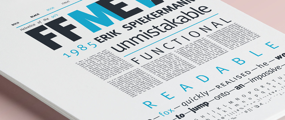
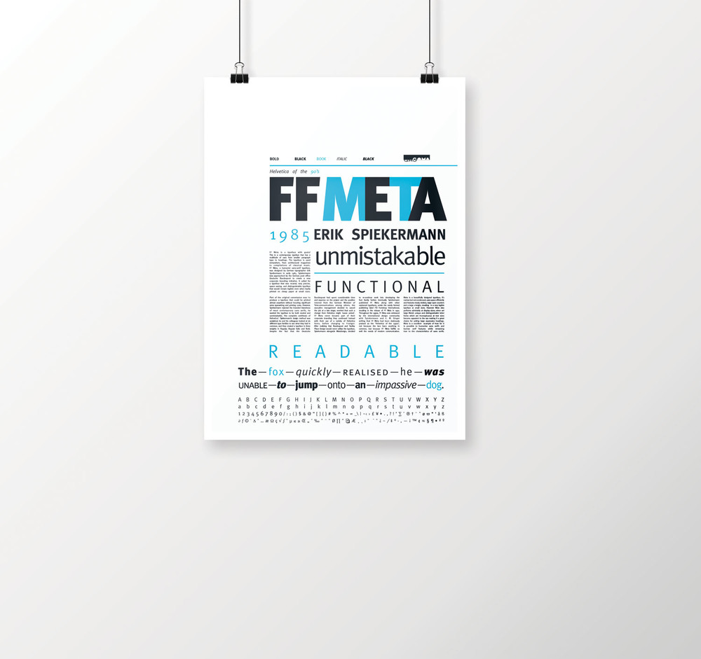
Brief: The goal was to create a poster that not only held historical information on a given typeface, but also had to use variations of weights and styles of the typeface, a glyph, a pangram and at least one paragraph explaining the typeface. The design and layout needed to utilise hierarchy as a means of helping the viewer interpret the information on the poster.
Tone: Historical with a contemporary edge
Idea: For this project I wanted colour, font size and font weight to guide and catch the viewers eye and make them want to get close and personal with the poster. I also wanted the layout and design to suit the unique letter forms of FF Meta. FF Meta is one of my favourite typefaces because of its unique history and design. It was through this initial typography project that I learnt the history of FF Meta and the workings of typefaces. I believe it’s important to know the history behind any typeface, as it adds depth, meaning and value to design.


